Heavyocity UX
Heavyocity creates cutting-edge software instruments for today’s modern composer and sound designer. Their signature sounds are utilized by a variety of acclaimed artists and composers across the music, film, TV and video game industries.
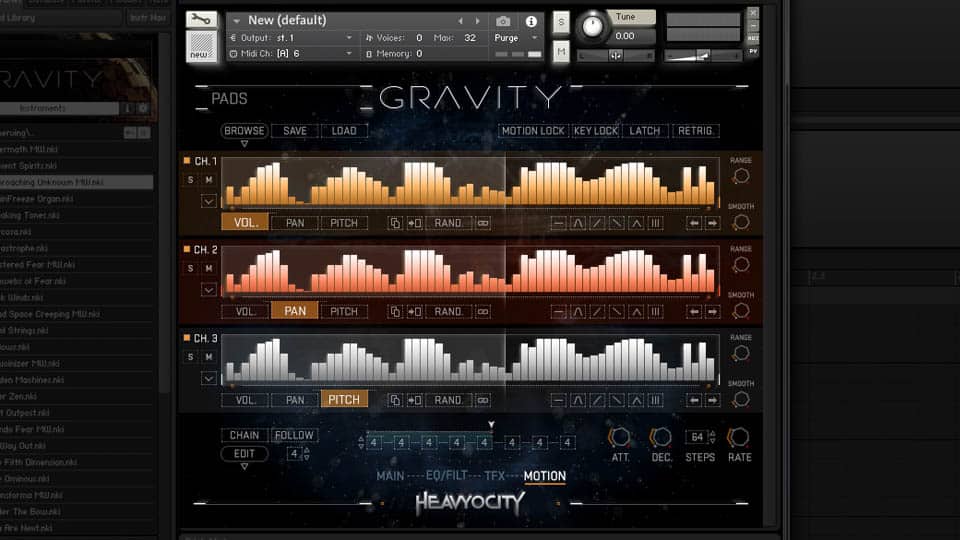
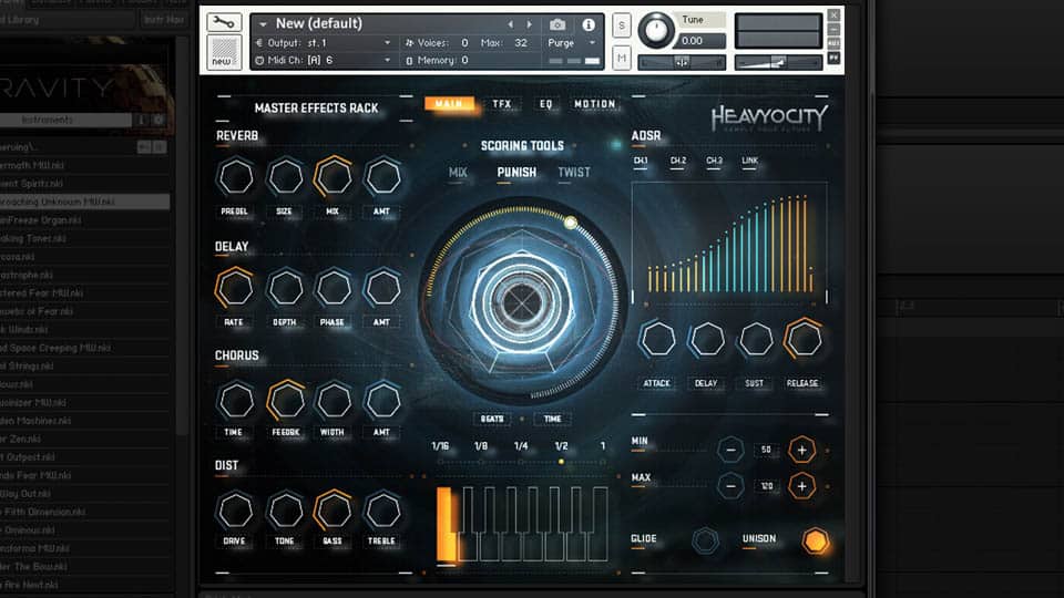
With a suite of award-winning products already under their belt, Heavyocity approached my team at Perception to design the look and feel of GRAVITY, their most dynamic collection of cinema scoring tools to date.
The virtual instrument community had long championed a skeumorphic approach to design; the market was flooded with products that were designed to look like physical hardware. While Heavyocity’s past products had employed this approach to great effect, for GRAVITY Heavyocity was eager to shake things up with a look that was as radical and forward-thinking as the software itself. Our challenge was to craft an interface that would take Heavyocity’s visual identity in a bold new direction, while upholding the tradition of intuitive, user-friendly UI’s that the brand’s dedicated base of professionals had come to expect.
The creative team became immersed within Heavyocity’s studio, getting a first-hand experience as to how a power-user audience would take advantage of GRAVITY’s robust features and functions. This discovery process was very collaborative, with Heavyocity providing hands-on access to an early GRAVITY prototype as well as initial wireframes of intended features.
Our artistic exploration began with an audit of inspiration and regions of interest, which was focused into specific suggestions for aesthetic approach. This allowed the Heavyocity and Perception teams to become aligned in terms of tastes and expectations, based on which ideas were the most exciting, surprising and unique.
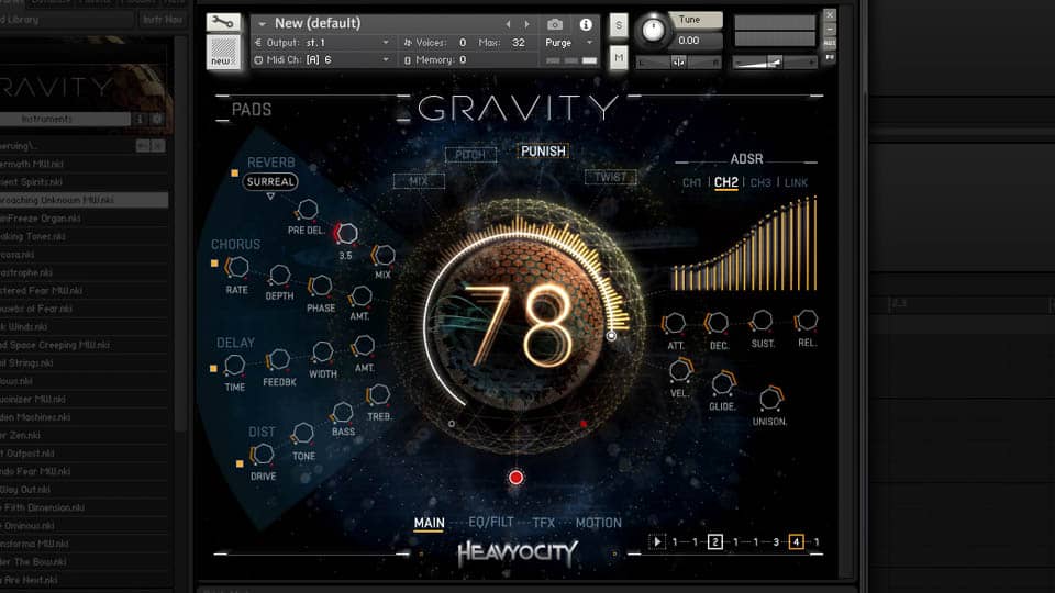
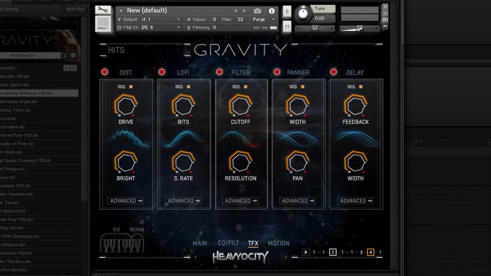
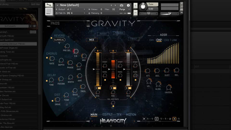
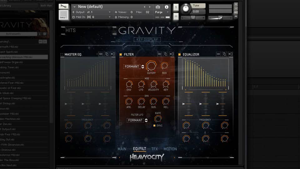
Perception’s early design explorations continued to explore mood while honing in on a layout that was both exciting and user-friendly. Part of the execution involved re-envisioning interface elements that had become hallmarks of Heavyocity’s brand, such as the innovative and powerful Punish knob.
Once an overall direction was established, we got to work designing 30+ screens, including key frames for every individual element and control. Throughout this process my team worked closely with Heavyocity to ensure that the UI’s cutting-edge design was fully aligned with the needs of GRAVITY’s audience, as well as achievable from a technological perspective. From an aesthetic perspective it was important that every aspect of the UI felt cohesive with the cinematic sounds lurking “under the hood.”
From the very beginning Heavyocity wanted GRAVITY to feel like a living, breathing interface, one that would excite and inspire its users in their musical pursuits. We sought to push the boundaries of what was possible within GRAVITY’s technological framework, while carefully considering the needs of the GRAVITY power user. It was important to introduce moments of delight which would “wear in, never wear out” with repeat viewings.
In the month leading up to GRAVITY’s release, Heavyocity sought to drum up excitement with a “teaser” video that would feature GRAVITY’s heavy sounds and show elements of its interface—all without revealing much about the product itself. My team team was happy to accommodate. Heavyocity provided the musical score and copy, we did the rest.
GRAVITY was released in 2015 and was one of Heavyocity’s most successful launches. The design and features have won widespread acclaim prom professionals in the industry and from trade journals. Since the release of GRAVITY, Perception worked with Heavyocity on several other products as well.
Read the full case study, including numerous customer testimonials on the Perception website.